Since 1940, serving small businesses in Western Washington with design and letterpress printing.
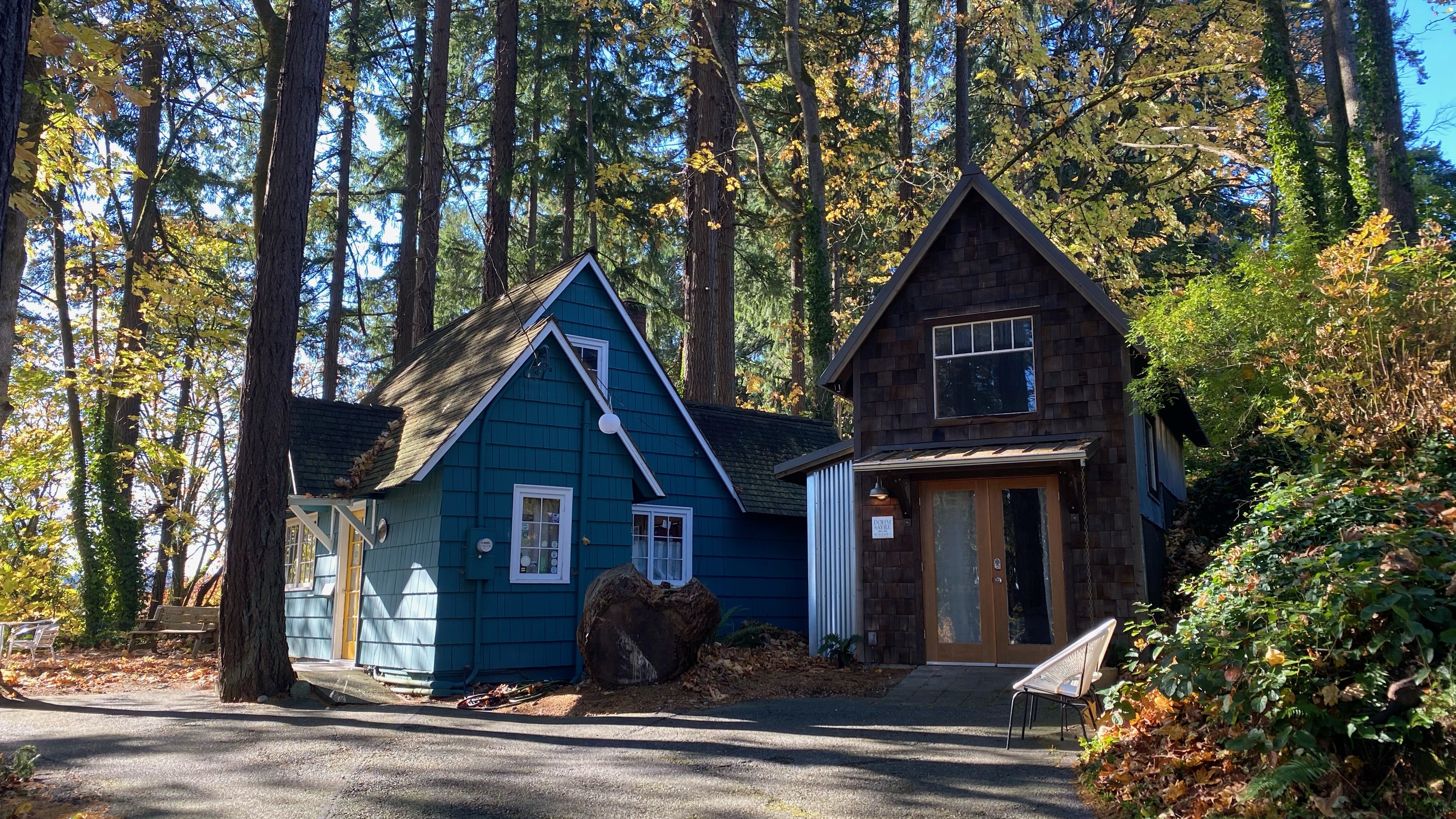
Our historic location on the bluff above Capitol Lake in downtown Olympia 
We’re an Olympia Heritage Site 
Founder Jocelyn Dohm with owner Jami Heinricher in 1999 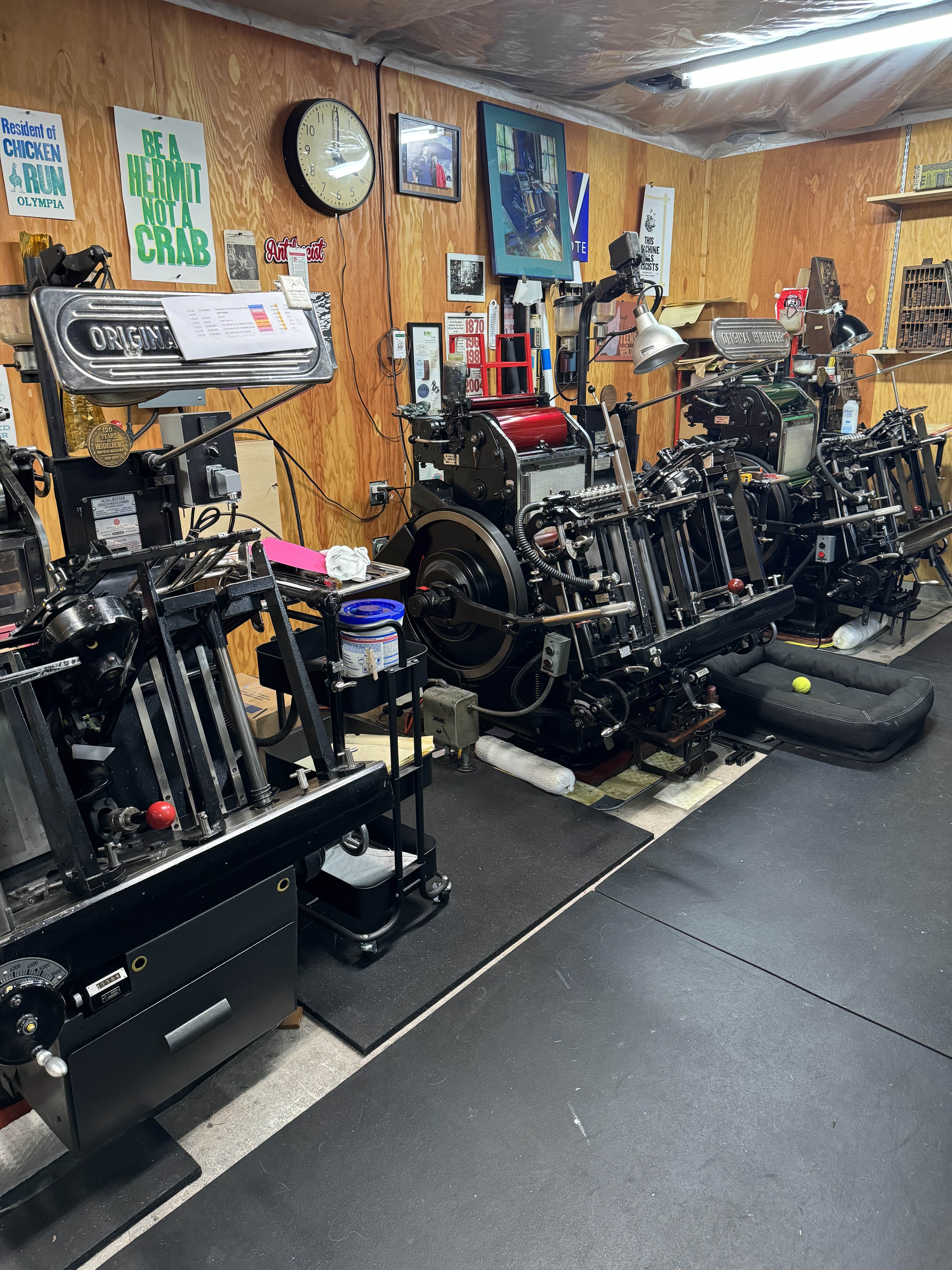
Our 3-Windmill lineup in the Annex 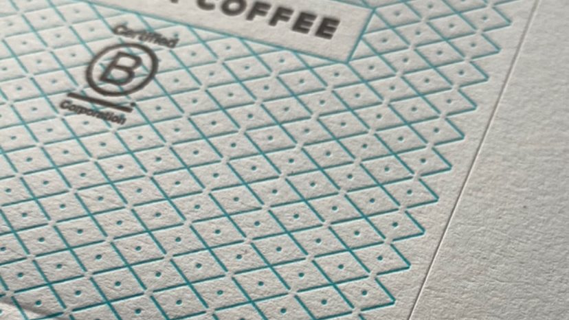
The best results come from designing for the process 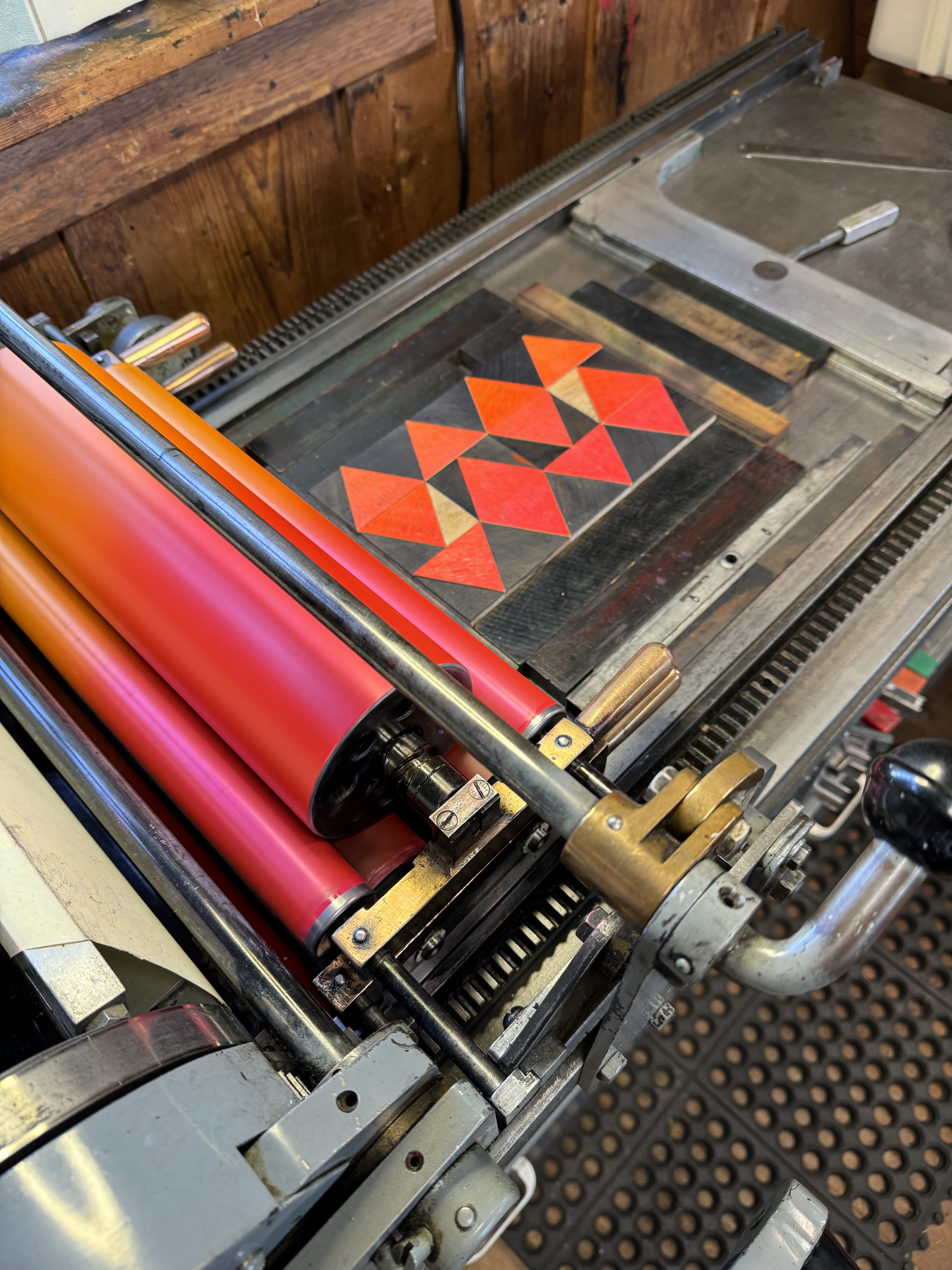
We have a very nice Vandercook 4 
1960 Heidelberg KS cylinder posing with Réka 
1911 Chandler & Price once used to print silent movie titles, and our 1953 Heidelberg Windmill 
The founder’s little sister carved this in high school 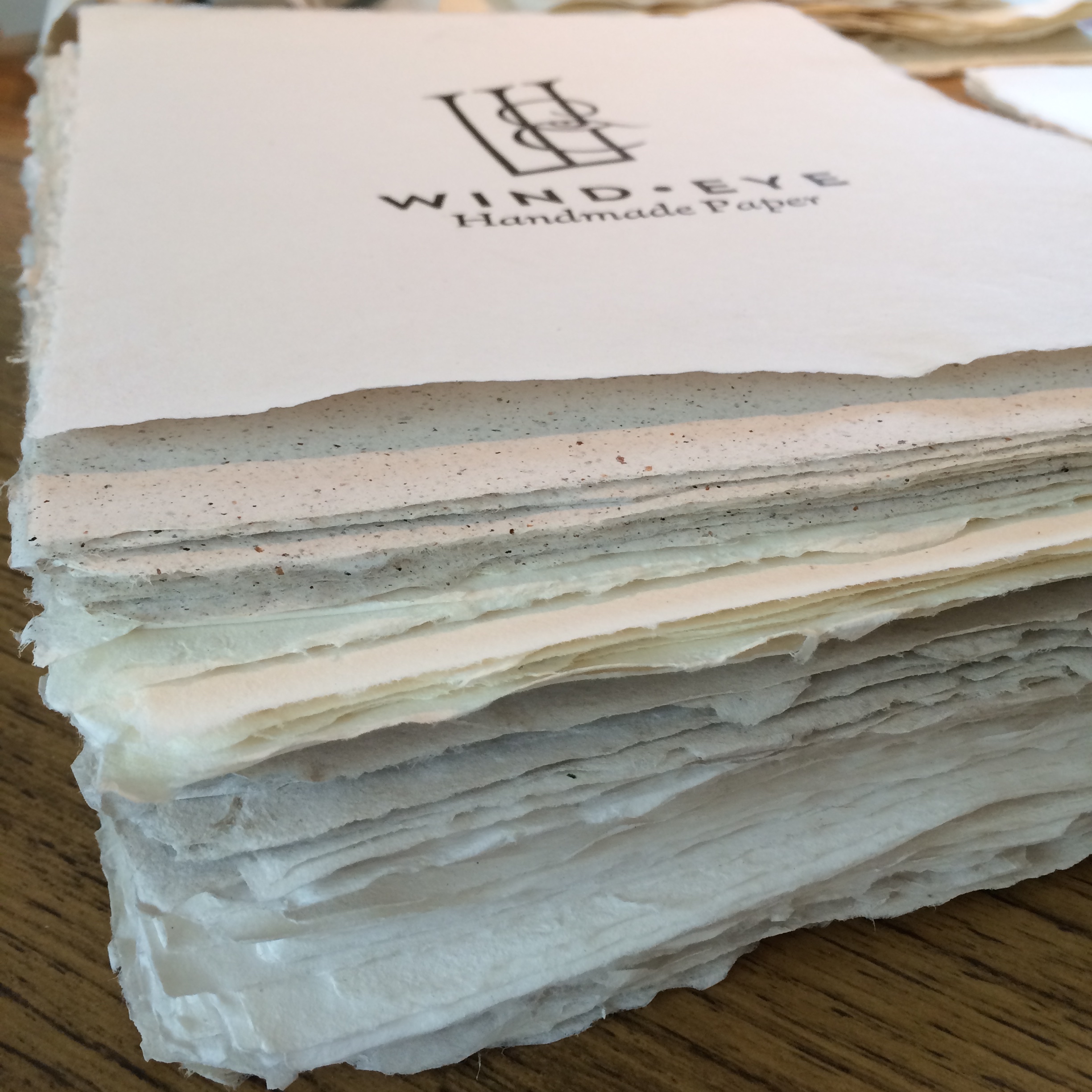
Our own WIND•EYE Handmade Paper 
We are a Certified WBE in Washington 
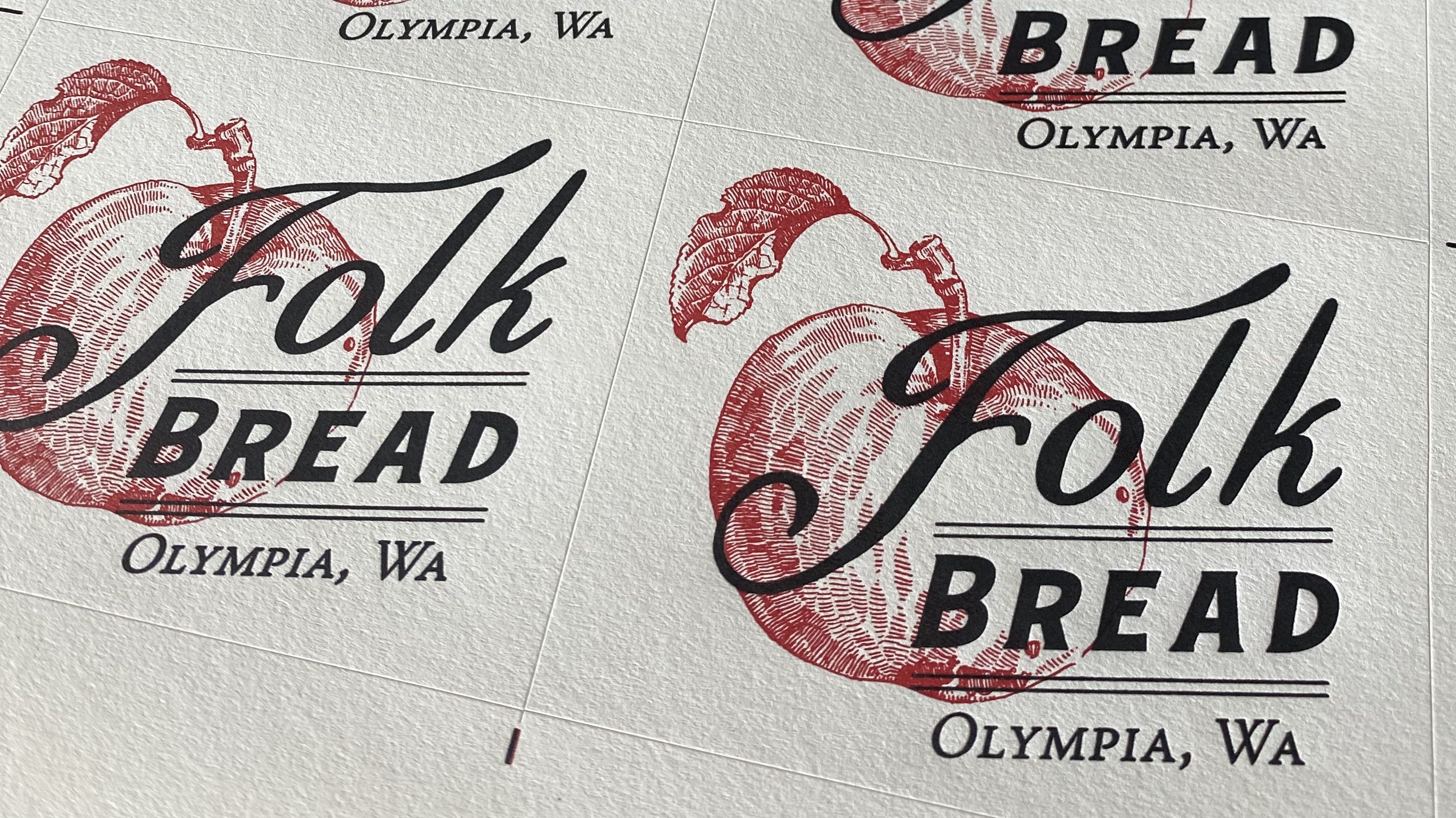
Polymer plates make it easy to print from digital design files
Design to Print Letterpress
We offer our customers a complete solution from design to print to offer you the most efficient service. We are also very happy to work with your designs and designers to achieve the results you want.
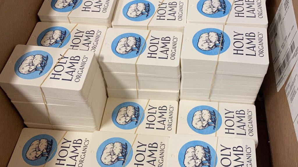
Custom Letterpress Labels & Tags
We offer custom label stocks not found anywhere else, and can die cut and print your custom labels and tags on our fleet of presses for unique, luxury results with impact.
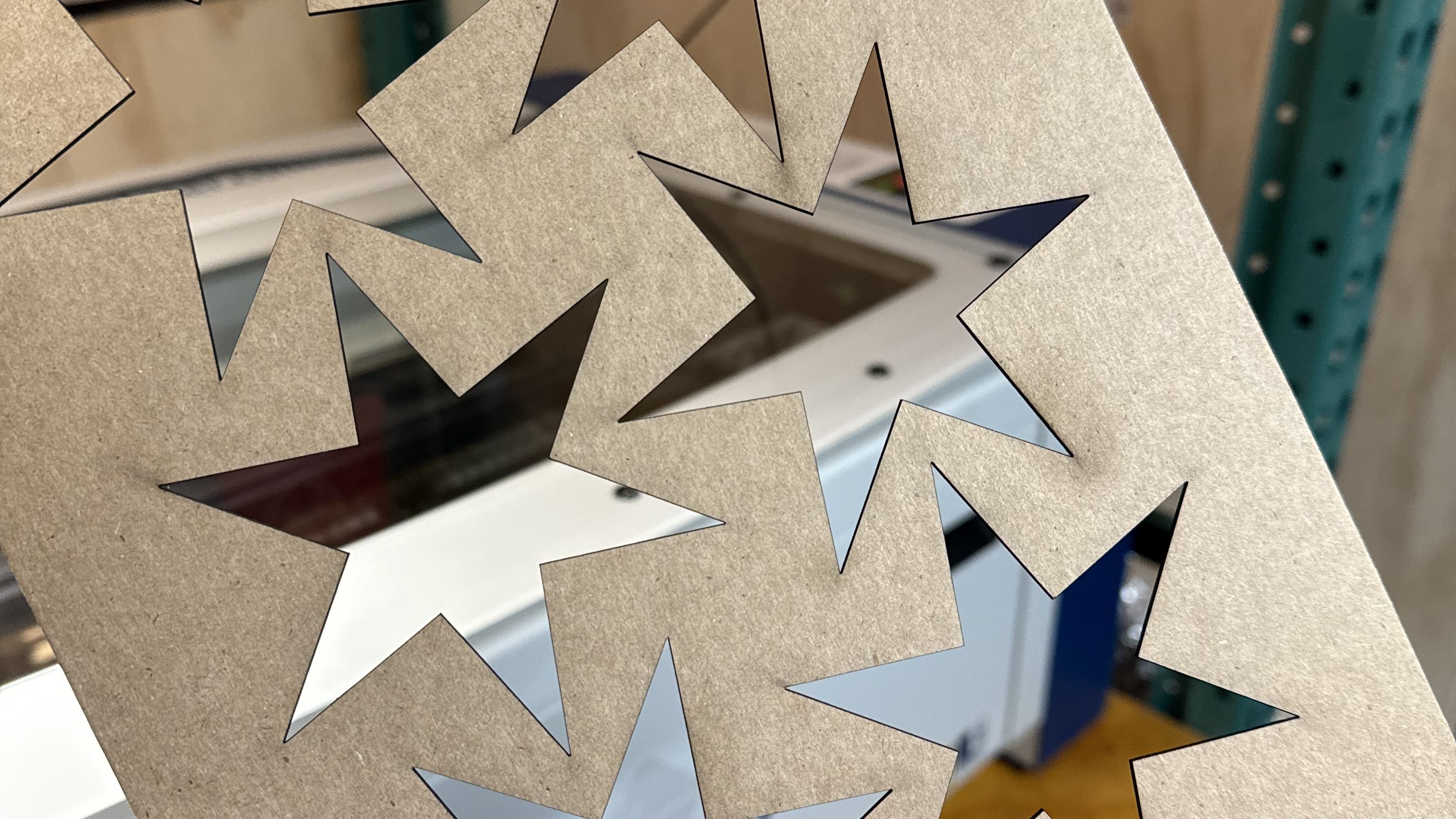
Laser and Rotary Engraving
Talk to us about laser-engraving items for your business, and if you have special engraving needs, our rotary CNC machine might just do the trick!
Some of our esteemed customers who use our labels and tags on their amazing products —
“I highly recommend The Sherwood Press for all your printing and packaging needs. As a trusted and reliable printing service, The Sherwood Press consistently delivers top-notch quality and attention to detail. For unparalleled quality, reliability and customer satisfaction, choose The Sherwood Press.”
Oliver Stormshak, Owner, Olympia Coffee Roasting Co.
Get In Touch
I look forward to hearing from you!
hello@thesherwoodpress.com
(360) 357-3855
811 5th Avenue SW
Olympia, Washington 98502
Opening Hours
Mon-Fri
9 am — 5 pm
Sat, Sun
Closed
Designed with WordPress
